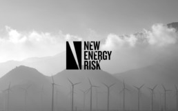
Empowering innovators to transform revolutionary concepts into revolutionary processes
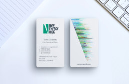
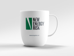
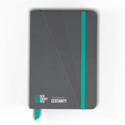
The New Energy Risk (NER) ID uses a stylized custom typeface and monolithic stylized “N” icon. The typeface displays NER’s groundbreaking approach. The forward slash elements within the icon, the E’s and K’s, are used to communicate NER's breakthrough approach. The disjointed type treatment was designed to show movement, adaptiveness, forward motion, and energy. The uppercase stacked font shows the seriousness of this impactful brand.
[layerslider id="5"]
[layerslider id="6"]