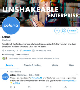
Unshakeable Networks
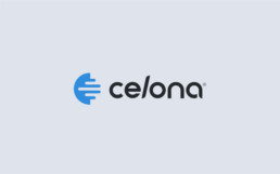
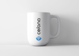
The Celona logotype is hand-crafted. The (l) is on a diagonal axis to represent the idea of networks having to be tuned-in and adjusted for optimal performance. It has both rounded and square corners to give a dynamic appeal. The type is agile upon appearance with a sense of strength. The Celona icon has a global enterprise appeal. It is a cropped view of a building’s corner with the lines dynamically move through it. They represent the strong micro-sliced frequencies needed to obtain the cleanest and most reliable signal to maintain a robust, unshakable Celona network within the enterprise. The shape of the icon is an abstract (C) for Celona.
